Modern Renovations is a premium residential construction company offering custom carpentry, home additions, and full-scale remodeling. The goal of this project was to design a website that reflects the company’s craftsmanship, precision, and client-focused service all while ensuring a seamless digital experience for homeowners exploring renovation services online.
UX Design
UI Design
Research
Websites Design
Industry
Property, Construction & Real Estate
Tools we used


Project Completion
2025
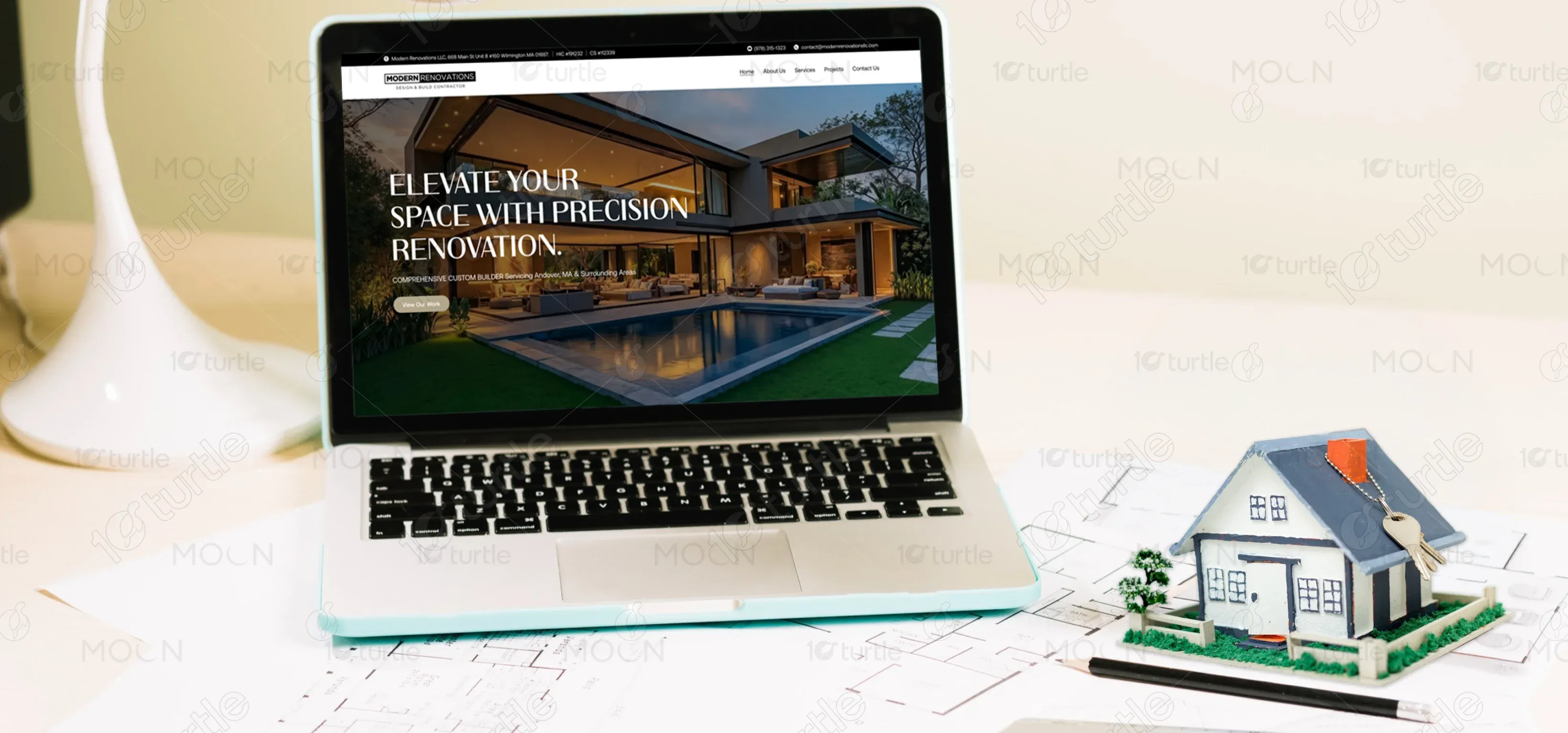
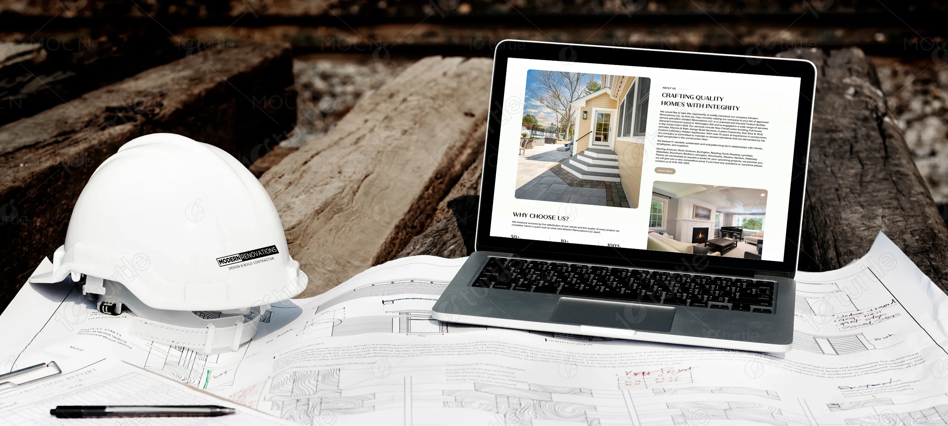
The client approached us to create a digital presence that matched the level of detail and care they deliver in their custom building projects. Their previous site lacked visual clarity, structure, and didn't communicate the breadth of services offered. The new website needed to present Modern Renovations as a trustworthy, skilled contractor while guiding users effortlessly toward project discovery and contact.
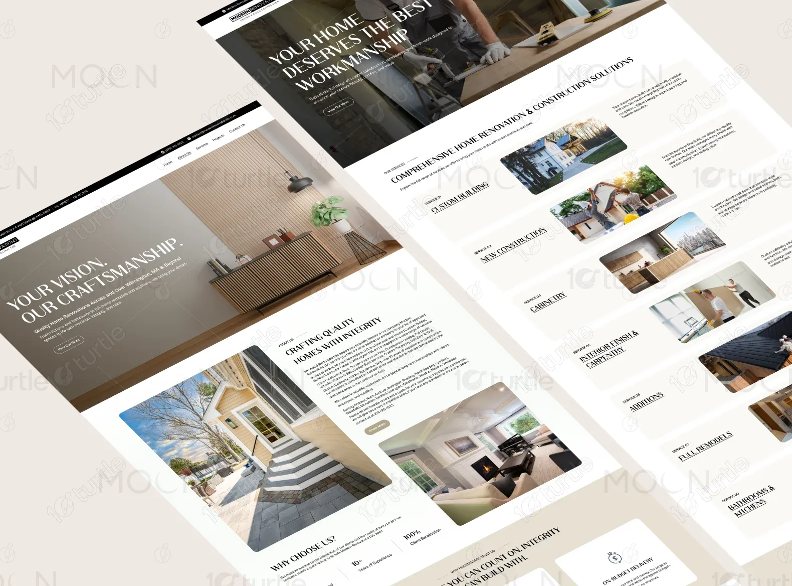
That was the guiding question from Modern Renovations’ founder. They wanted the site to express a sense of care, structure, and confidence qualities clients experience during every project. Our job was to translate that feeling into a calm, high-end digital environment that felt intuitive and welcoming.

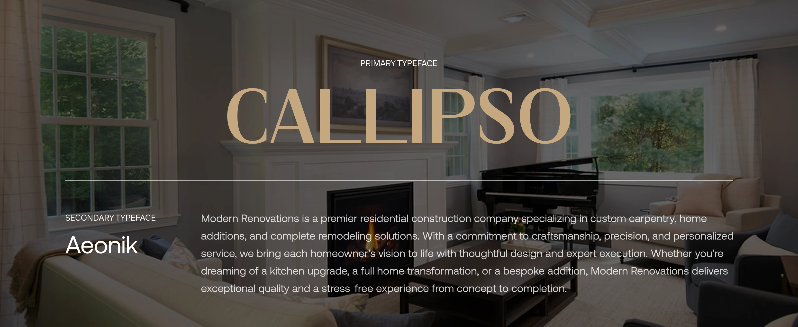
The Modern Renovations logo is presented in an all-uppercase, contemporary serif font that aligns with the company’s clean and professional image. Positioned prominently in the header and footer, the logo anchors the site’s brand presence without distracting from content. Its monochrome styling works seamlessly across light and dark backgrounds, contributing to a timeless, minimal brand system.
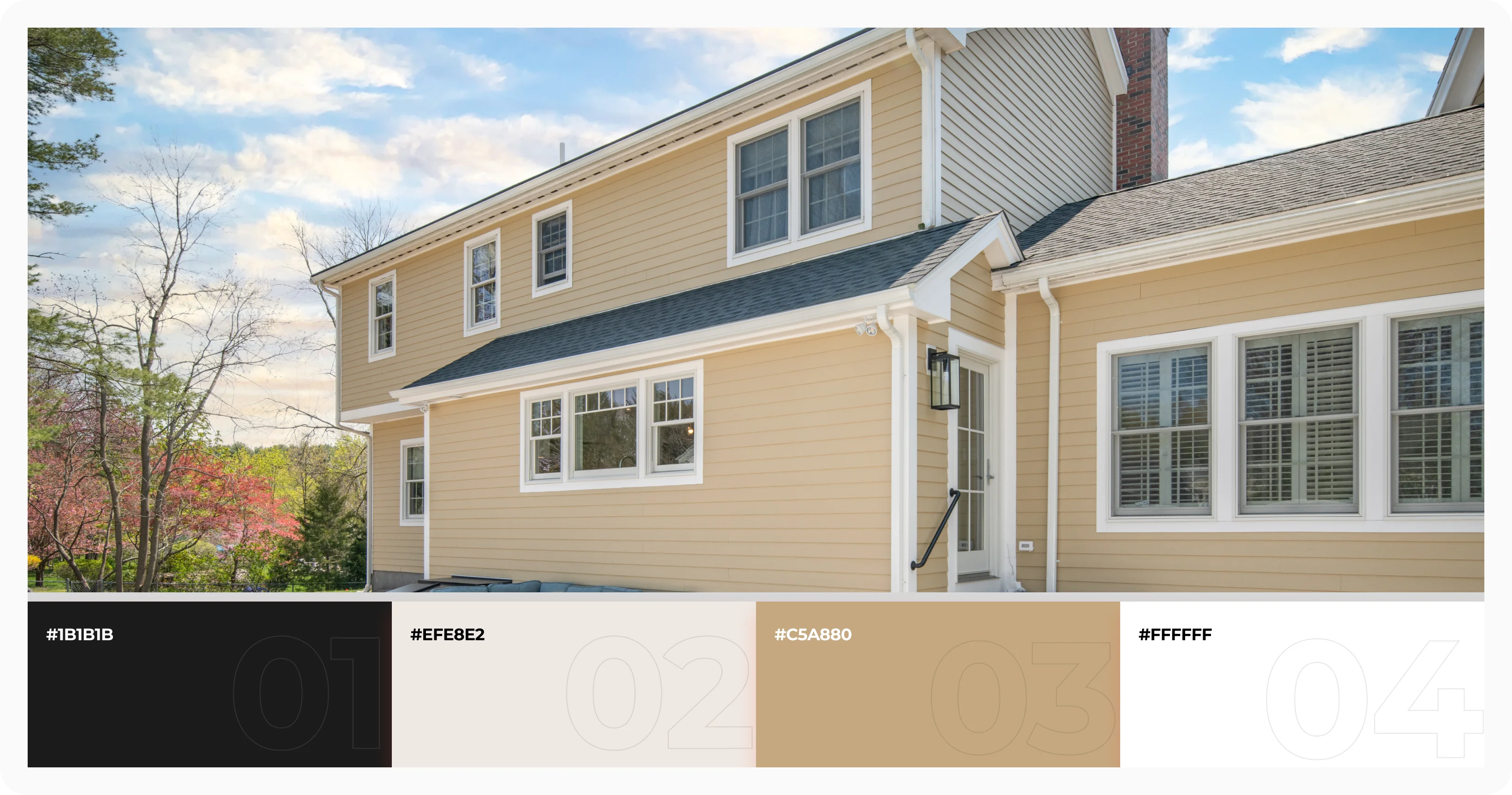
The site’s color palette was chosen to reflect warmth, professionalism, and high-end service. The primary color is a rich espresso black (#1B1B1B), used for text and accents to provide contrast and elegance. A soft neutral beige (#EFE8E2) serves as the background tone, creating a welcoming and breathable aesthetic. A refined tan-gold accent (#C5A880) is used sparingly in buttons and highlights to suggest quality and refinement. Together, these colors create a clean, harmonious interface that feels grounded and approachable.
Wireframes for the homepage were created to establish a clean layout with clear visual rhythm. We focused on intuitive spacing between sections, generous white space, and logical grouping of service categories. The wireframe also helped define how testimonials, trust-building metrics, and CTAs would be positioned, ensuring the final site would feel complete and user-friendly without clutter.